Gateway to Environmental
Sustainability
The challenges ahead were a driving force behind the establishment of KRANZINDO, a Limited Liability Company that specializes on faucets and taps. In 2014, Perusahaan Dagang Mutiara Putih (KRANZ) embarked on a journey to expand its capacity to better serve the market. They sought an identity that embodies dynamic leadership and a fresh approach, reflecting unity, environmental stewardship, innovation, and new ideas.
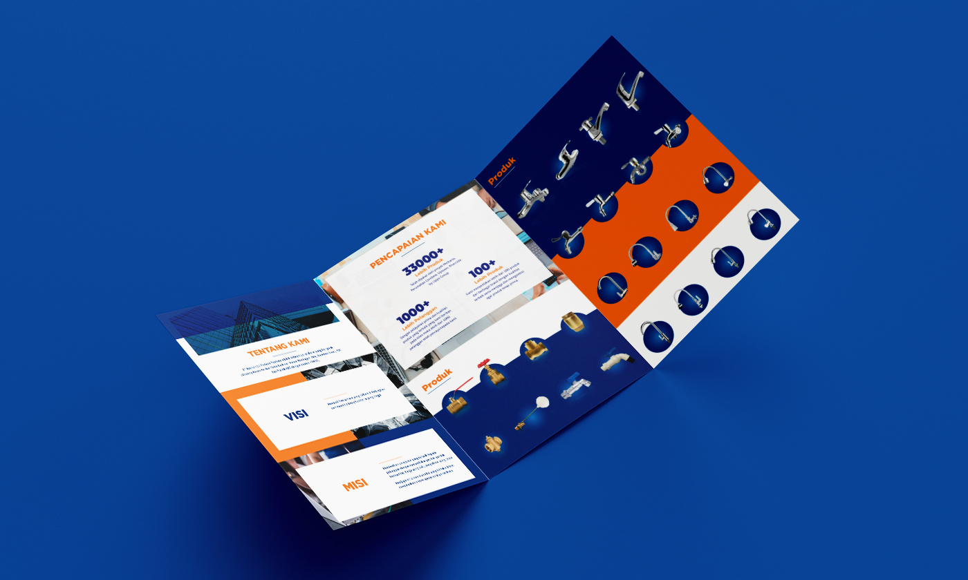
Avion was tasked with creating an identity that communicates to employees and competitors alike that KRANZ is more than just a trading company. We crafted a corporate identity symbolizing Kranzindo's commitment as a solution provider in water management.
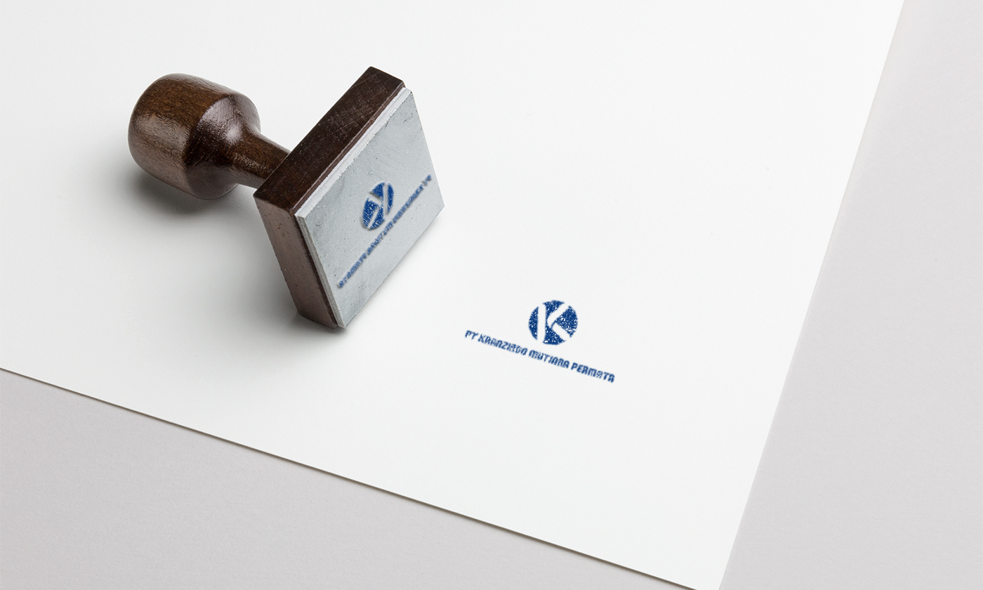
The logo, shaped like the globe, represents water's global importance. Inside the circle, the dynamic K shape reflects a new spirit, moving forward with fresh energy to enhance the company's performance and productivity. The modern typography adds seriousness. The color blue signifies trustworthiness and responsibility, while orange adds freshness, innovation, solutions, and balance. With unity among employees to achieve goals and a new identity, KRANZINDO is ready for the future of water management.


